This is the completed opening of the revenge.
Friday, 22 April 2016
Thursday, 21 April 2016
Wednesday, 20 April 2016
Construction: Evidence Of Creating The Opening Titles


We stared off by looking at looking at different fonts and different sizes of the titles. This is a very important part of the opening because it shows the people who contributed to the film but may not be on screen. Also it can create an atmosphere in the opening as some fonts would not suit the genre of the film. We tested all sizes, small and bigger fonts to see what ones we thought would create the best atmosphere. We also tested different fonts itself, so different styles of the text. We also had the decision on where on the screen we were going to places the titles. We moved them around to see where they best fitted on the screen. We also looked at what colour would be best suited for our opening and will go well with the background colour.
Friday, 15 April 2016
Construction: Evidence Of The Editing Process For Our Film Opening
The first screen shot shows our first edit of the opening.

We had to adjust the continuity as it was not correct because he was standing still when he should have been walking.

This screen shot shows me erasing part of the clip that we didn’t need anymore.

The continuity wasn’t correct in this shot so we took out this clip and replaced this with a title.

We cut the start of this clip as the continuity as it wasn’t following from the previous clip.

We had to re-order some of the shots so the match on action was correct. we moved the two clips of Billy at the book so they was following on from each other instead of them being at the start and the end of the clip, as there was no way from him to get back to the book.

We added a title showing the directors name. This is the most important name of the film. This is why this titles appeared first in the opening to our film.

We changed the length of the titles from 5 seconds to 3 seconds because they were too long and it increased the time over our target for the film opening.

We moved the titles for the main character from the middle to the top left.

Then we added the name of the second actor which we also moved but this time to the bottom right.

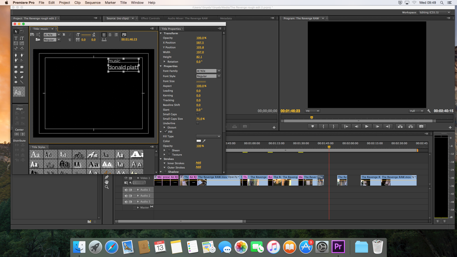
We then added another title named music and the name of the composer of the music, however the music was in a smaller font than the name so the nam stands out to the audience.

This screenshot shows what the title will look like during our film opening.

This shows that we have exported our clip however is it without sound at the moment.

Video of The Revenge (no audio)
This is the editing of us adding in sound.
This is some screenshots of us finding a sound effects and music to use in our opening.


This is us adding in the sound effect. This sound effect creates a jump for the audiance as it is a loud sharp sound. This sound is very important is it creates a scary atmosphere and without this sound it would not feel like a horror film opening.

This is after the sound has been adding in. We are then using the colour balance effect to change the colour of the image to a red.

This is then what it looks like with the red effect.

This is what our opening looked like after the sound had been added

We had to adjust the continuity as it was not correct because he was standing still when he should have been walking.

This screen shot shows me erasing part of the clip that we didn’t need anymore.

The continuity wasn’t correct in this shot so we took out this clip and replaced this with a title.

We cut the start of this clip as the continuity as it wasn’t following from the previous clip.

We had to re-order some of the shots so the match on action was correct. we moved the two clips of Billy at the book so they was following on from each other instead of them being at the start and the end of the clip, as there was no way from him to get back to the book.

We added a title showing the directors name. This is the most important name of the film. This is why this titles appeared first in the opening to our film.

We changed the length of the titles from 5 seconds to 3 seconds because they were too long and it increased the time over our target for the film opening.

We moved the titles for the main character from the middle to the top left.

Then we added the name of the second actor which we also moved but this time to the bottom right.

We then added another title named music and the name of the composer of the music, however the music was in a smaller font than the name so the nam stands out to the audience.
This screenshot shows what the title will look like during our film opening.

This shows that we have exported our clip however is it without sound at the moment.

Video of The Revenge (no audio)
This is the editing of us adding in sound.
This is some screenshots of us finding a sound effects and music to use in our opening.


This is us adding in the sound effect. This sound effect creates a jump for the audiance as it is a loud sharp sound. This sound is very important is it creates a scary atmosphere and without this sound it would not feel like a horror film opening.

This is after the sound has been adding in. We are then using the colour balance effect to change the colour of the image to a red.

This is then what it looks like with the red effect.

This is what our opening looked like after the sound had been added
Construction: Evidence Of Our First Rough Edit Of The Revenge
This is the rough edit of ‘The Revenge’. It is currently 2 minutes 6 seconds long, the finish product needs to be 2 minutes but when we’ve made the final edited sharper it should drop to about 1 minute 50 seconds and with the extra seconds we can add titles.
Subscribe to:
Comments (Atom)